PC Battle 4 - The Final Showdown

Who has the best cards and should win the PC Battle?

  • KB. - Al-Farouq Aminu

    Votes: 4 9.3%
  • nichj99 - Kenneth Faried

    Votes: 23 53.5%
  • araiee - Lebron James

    Votes: 7 16.3%
  • kiwi_in_melb - Dwight Howard

    Votes: 9 20.9%

  • Total voters
    43
  • Poll closed .

drob50

Magic Johnson and David Robinson ON CARD autos
Messages
9,435
Location
Perth, Western Australia
Real Name
Adam
eBay User
None
Its down to the last four competitors to battle it out for the title of the 4th PC Battle champion and whoever it is has to REALLY earn it as the entries are stunning!


KB. - Al-Farouq Aminu

Aminu Brilliance Game Time Jerseys Jumbo Patch /10


Aminu National Treasures RPA Gold /25


Aminu National Treasures NBA Logoman /3


nichj99 - Kenneth Faried

Flawless Emerald Patch/Auto /5
image-jpg.135958


Gold Standard Bullion Brand jumbo tag /2
image-jpg.135957


National Treasures Dual Logoman w/Iguodala /4
image-jpg.135956


Araiee - Lebron James


03/04 sp authentic rookie auto graded 9.5 and 10 auto
DSCN0510.jpg


07/08 ud black gold ticket auto /15
DSCN0330.jpg


04/05 sp game used dual auto with kobe /25
P1010066_01-1.jpg


kiwi_in_melb - Dwight Howard


04/05 (rookie year) Exquisite patch auto


09/10 NT Logoman


08/09 Exquisite All Star logoman
 
Just parking this space and will finish off the other two soon - yes, I'll keep nichj99 waiting as long as possible - hah hah

KB - otherwise known around these parts as patch royalty!

This is the deepest round of the competition and the patch king busts out some Brilliance which is hardly a high end product!
The jumbo patch has all the qualities you'd expect, big window, multiple breaks and stitching which features straight and curved lines which adds a nice touch to the overall look of it. The card itself has a good blend of full colour graphics and pics with the big metallic chrome finish. It reminds me of the big yank tank gas guzzlers from the 50s and 60s with their bright paint finishes and the big chrome grill right in yo' face! Coupled with that great front on action pic feels like Aminu is sizing you up off of the dribble and about to break you down... What's not to like? Well as big and juicy as the patch is it still is only two colous and is a little bit lacking when it comes to what great colours we expect from Hornets patches. The big mono-chrome look is also something you love or hate - for me it just looks a little half baked finish with not a lot of contrast.

I'm pretty sure KB has dropped a NT RPA in each round so far and he's saved the best for last! It's a young looking Aminu and even though the Clips jersey isn't the best this card takes the choicest bit of the logo and whacks it smack dab in the middle of the card. We've got the triple team colour, insane number of breaks, stitching on stitching (you know when a patch is that chunky you just want to trace yoru finger over it more than once! Tell me it ain't so KB?!) The best patch is a chunky patch raising out of the card like a 3-D pop-up book! Most notable of all you know exactly where it has come off of the jersey because the pic matches the patch and the card tells a story. The well trained eye will also notice this is the rarer gold version too so it just adds that extra little bit of class! Oh, and classic old school scorpion sig - nasty!

Hmm, I guess everyone has to bust out the logoman in the finals. It's the Rolls Royce of any PC collection. Not all logomen are created equally though... What's nice about this particular offering is that the whole card is designed around the logoman itself. How do we know that? 1) The card is called 'NBA Logoman' 2) A purpose built window to accomodate the logoman (great looking border btw) 3) A great pic of Aminu doing his best Jerry West Silhouette impersonation. Even the subtle green hatching behind the pic is a nice touch which is in keeping with the design of the whole card. Overall, I guess you'd just say the card just has a nice feel to it and everything seems in its place - the lettering, the pic, the borders, the colours, the layout. Just a great card. What's not to like is the stamping underneath. 3/5? If this is the Rolls Royce of my PC there shouldn't be 4 other guys out there with the same card! Just leave the stamping off the card! Oh, and a red card for whoever listed it as /3! LIES! :red:


Araiee aka Bron Bomber is at it again!
Big on card Bronski autos left, right and centre from round 1 to the grand final! This guy's collection is as consistent as it is DEEEEEEEEEEEP!

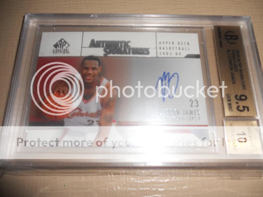
The rookie year auto captures a young Bron signing a very abbreviated sig. I like the rookei year cards because it captures that moment in time before he knew what lay ahead of him, Lebron didn;t know if he was going to be the next Hakeem Olajuwon or Kwame Brown. It also reminds us of how young he was leaving high school straight for the pros - the last of a generation of such players. The card itself is 0.5 away from being technically absolutely perfect. The cards shortcomings are in a way kind of endearing for a rookie year auto. The shortened sig and cheesy staged rookie photo shoot just all add to the innocence of this card and alludes to a time when King James was yet to ascend to the throne. It has to be said though that the card design itself though leaves a lot to be desired <insert player pic and auto here> and just isn't as nice as some of the lowered numbered, higher end stuff...

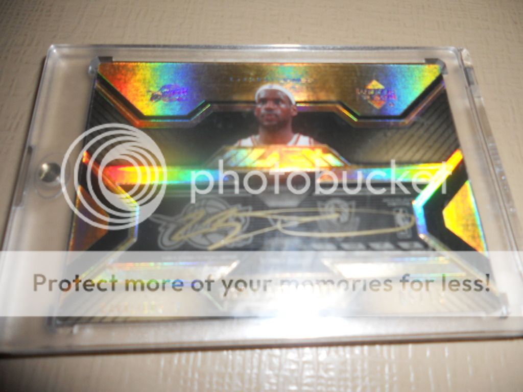
...some low numbered and higher end stuff such as this highly sought after Willy Wonka Golden Ticket! This card is literally Black Gold! Texas Tea! The stuff that millions search for and very few find! The black and gold colour combo has been around since cocky was an egg and the golden auto just rocks my world - it's big and blingy just like the card itself. It demands attention! The imprinted team and manufacturer logos and that classy metallic shimmer add that touch of class which lower end products try to emulate or imitate. The horizontal auto box allows for the massive sig which is showcased in all its glory. The golden sharpie is a nice touch and it would have been good to see Bron in at least a yellow Cavs jersey for some added impact (or perhaps the gold and marone jersey they had at one point). A big pic or some GU material would have made the card too busy so the simplicity is truly elegant, sometimes good design is just knowing when to stop. The small portrait pic is reminiscent of notable historic figures on our stamps and currency. ..and yes, this card definitely has value too! /15 - impressive!

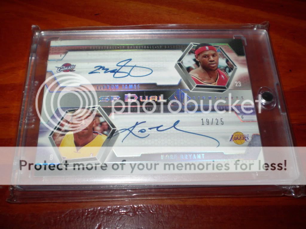
The SP dual is a bit of a controversial choice for the final, because if you're a Kobe fan it just reinforces what LBJ isn't. For me though Bron > Kobe so it reminds me of his all round game. I love the photography here because it captures the holofoil in all its glory and shows off all of those sweet little symmetrical design elements, like the pics, logos, massive signing space and same sharpie. What would have been great is if they reduced the signings space and instead of the portrait pics had full body length pics as if they were staring each other down across the card, sizing each other up as it were. Perhaps a little more effort on that instead of fancy 3-D looking hexagons would have put this card over the top! As it is though a super fine card which all Kobe and Bron collectors would have chased with a passion.
 
The small flightless bird from across the ditch overcompensates with some high flying Dwight action!

It's not a bad 3 card lot when each one features either logo action, Exquisite branding or both!

The big Exquisite patch auto kicks things off by droppign the hammer on a massive, massive on card signature which imo looks even better because of the streakiness, it's kind of like being mesmerised by the brush strokes of a great calligrapher or artist. It's hands down the best DH12 auto I've ever seen - the thickness of the auto really makes it pop. You can't get that same sort of nastiness with a ball point pen or on a sticker! The angle of the photo also shows off the card subtleties like the textured border to the patch window and the texture of the background itself, that's why Exquisite were the best in the business. As for the patch, it isn't jumbo sized but it sits nicely with the card with good 3 team colour (which matches the blue jersey pic) and several breaks. If that patch didn't have any blue in it though I would've sworn it would have been the spur from San Antonio's logo. Everything blends well, from the card details all the way to the numbering which does kinda seem a little bit high for Exquisite patch autos. /100, really? Bonus points for the asian ebay 1/1 (they love their number 8s!). Minus points for the card labelling him as a generic 'Forward' (yes, I'm sure he'd match up well with Melo on the perimeter...) and the lacklustre pic. The wind under the jersey reminds of the NBA 2K time out glitch and rebounding the ball around your belly button??? Young ballers everywhere avert your eyes and remember to focus on fundamentals!

Logoman! Says it all really... Except this one isn't quite the same as the rest. This one looks beaten up and rugged and the texture of it with the visible horizontal strands reminds me of a tornado logoman or a mummified logoman wrapped up in bandages. I'm going with the latter... Don't get me wrong, I think it adds character and sets it apart from the rest! The Mummmy of all logomen as it were - lol The words National Treasures, Colossal and Prime normally auger well for a special card and this is no exception but for something this special you really have to come up with something more unique. Calling a logoman 'prime' is almost an insult, you can bandy that term around with pin stripe GUs these days. The colour scheme is nice with plenty of Magic blue and white but some of the little things like the his name off to the side, the big COLOSSAL wording with one arm dangling over the writing seems kind of well, superfluous. ..and what is that greyed out image in the background? The helm of a ship? The biggest bug bear for me though is when memorabilia cards don't fill the window properly which appears to be the case here to the top and left hand sides. Maybe the Mummy is trying to escape! Head for he Hills people! Actually the only thing not moving, shaking or heading for the Hills is that pic of Dwight. It is a great picture of him um, standing still though!

Great Holy Snapping Turtles of the Galapagos! There's no faffing about with this beauty! This is what only can be described as a jumbo logoman patch! Just look at the size of the thing! What's nice is that you can still see the some of the bordering lines from the star which is testament to Dwight's all-star calibre playing credentials. When you stop to think about it there are 82 chances to get a logoman in the regular season, potentially dozens more in the post season but only one chance peryear (if that!) to land an all-star logoman - as rare as hen's teeth my card collecting friends! I'm just pointing that out because the stamping /39 does this card no justice at all! I even like the fact that it doesn't feature the whole logoman emblem because just like a woman who is a good tease it just leaves you wanting to see more! The gold foil, nice design (the radiating stripes are in Magic colours too btw - nice touch!) and overall aesthetic is very pleasing. Dwight is even trying to give us his best logoman impersonation in the pic - nice try big fella - an A for effort! The only real downside to this card is that it makes me wonder what happened to the rest of the patch? Is there another exquisite prime with logoman feet only? Kind of a sobering thought... But gee whizz I'm just nit picking - what a stunning patch, from the neck down that is! First we had Mummy of all logomen, now we have butterface logoman! :)
 
@nichj99 and his Manimal collection is quickly becoming known as Beauty and the Beast (y'all can decide who is whom!).

Kicking things off with some emerald green, for some reason green always means /5 so we always associate the colour with short printed super high end quality, as attested to b the stamping which is front and centre and somewhat ironically the only wording which ISN'T in green foil. Consistency people, it's all about consistency and the small things can and do make a difference. Yes, there is a nice big on card auto but for some reason these days they stick them up in the top right hand corner of the card which isn't where your eye first wanders, the auto almost catches you by surprise as a pleasant afterthought. The funny thing is the card was actually designed that way with his name, team logo and massive wording in the middle soaking up the prime real estate ...and while we're on he subject of autos this ain't no nasty scorpion sig! If somebody showed this to me there's no way on God;s green earth I'd be able to make out a KF, abbreviated sigs don't do high end cards justice, but you can;t blame panini for that - it is clear and on card and that is about all you can ask for. The real centrepiece is the stunning 4 colour patch straight off the D or R, even a noob like me can figure that out because it's absolutely crystal clear and well centred. It would have been great to see the DENVER on the jersey picture but for some reason that;s exactly where the pic starts to fade away... Maybe he plays for the Dublin Emerald Nuggets from Ireland or something?!

Oversized tag with logo and jersey size goodness has to be respected! They could have probably made 3 or so Tag Team Quads out of this bad boy by itself! I think on this card they deliberately avoided using the word prime so they could call it 'superfine' or something similar. Adding extra value is the fact that being numbered 2/2 actually makes it a 1/1!!!! Hmm, what kind of weird voodoo mathematical trick is that?! I would have liked to see some scrawled texta on the bottom grey bit to just add that real game worn feel. There;s also no reason why they had to go with a FT shooting pic here or stick with the Gold Bullion name which has absolutely zero reference to the uniqueness of this card. How about a title along the lines of Laundered Gold?? lol, probably not but you know what I'm trying to say.... As for the stamping, well, I'm not sure if it adds too much - maybe stick it on the reverse in a decent position? I could hardly make it out when I first saw the card and if the picture was just a tad higher Mr Faried would have had 2/2 emblazoned right on top of his two golden orbs! One last note - I'm not sure if my eyes deceive me (yet again) but is that a surface chip above the I in Bullion?! Hmmmm, I'll give the benefit of the doubt to nichj99 on this one though - his cards are way too good to suffer from such amateurism!

Okay, quick question. What's better than a logoman? Two logomen! The rarity, the significance, the overwhelming awesomeness of the pinnacle of NBA cards is scaled not once, but twice! That's kind of the equivalent of scaling Mt Everest, descending to base camp and then climbing it again because you forgot your car keys. You scaled the highest peak twice! Incredible! Still, as great as hat is there is always something that can be improved upon... In this case it reminds of the fact that one of these guys actually won a NBA Finals MVP award and the other hasn't even experienced getting out of the first round of the playoffs. It's kind of like being the second guy to set foot on the moon... I do like the card design though, the symmetry of the photos which feature the logoman, the somewhat thoughtful name (NBA Logoman Combos - informative and accurate if nothing else but not exactly a witty pun that leaves you smirking). Love those throwback jerseys too - Mile High City! However, I don't know what photography school these blokes went to because that Faried pic is basically covered in dark shadows! All I see is a pair of eyes glaring out at me ominously like something out of Mortal Kombat! ...and again on the numbering, knowing that there is 3 more of these bad boys floating out there just destroys the magic and allure of this card - well at least a teensy weensy bit anyway!

Flawless 3 x logoriffic final round is one for the ages!

Now my fingers need a rest - what's the prize for OZCT Finals Commentary MVPoster? You all owning the cards is the easy part! :lol:
 
I heard the winner has to give his winning cards to you Skip!

In that case.....let me have a look at those fantastic King James triplets, I think I made a mistake in writing them up so poorly..........

Bumpski - 38 votes total is an absolute abomination!
 
Well done @skip20 on the fantastic commentary. =D>

And PS - that's just dust on the bullion brand, aint no chips like that on my high end cardboard :lol:

OK mate, just let me know when you have a chance to bust out that high end cardboard you speak of so I an see it instead of all this Faried stuff! lol :rofl:
 
wow, @nichj99 is still leading. though i don't get why anyone would vote faried over lebron. lol.

It's all about who has the best PC cards, so in theory someone who is a super collector of say Greg Stiemsma could have a better PC than someone collecting Michael Jordan. It's all about the quality and rarity of the cards - not just who has the best player collection otherwise yes, current players like Lebron would be beat out most other players like Aminu, Faried and even Dwight....fairly easily.
 
.....aaaaannnndddd the OFFICIAL winner of the Fourth edition of the OCT PC Battle is......

NICHJ99 - KENNETH "MANIMAL" FARIED

With all of these ridiculous entries over the rounds:

2012-13 Flawless Diamond RC #/20
IMG__0005_zps84312f7f.jpg


http://s1299.photobucket.com/user/joshnicholls21/media/Kenneth Faried PC/GUs and Relics/Prime Patches/IMG__0019_zpscfa6f271.jpg.html?sort=3&o=17

2012-13 Immaculate Authentics #1/3 (rookie)
IMG__0019_zpscfa6f271.jpg


2012-13 Gold Standard Black Gold Threads Prime #/5 (RY)

11267313_885317794865255_216890397_n-jpg.134769


2012-13 Flawless Autographs Platinum 1/1 (RY)

2012-13FlawlessPlatinumauto1of1KennethFaried_zpsc73b1a81.jpg


Flawless Emerald Patch/Auto /5

image-jpg.135958


Gold Standard Bullion Brand jumbo tag /2

image-jpg.135957


National Treasures Dual Logoman w/Iguodala /4

image-jpg.135956


WOW! A surprising result IMO... not because of the winner, but because of the dominance on the poll! Great work @nichj99 you did a good job of putting up variety in each round and keeping enough ammo in your arsenal for the final!

Thanks to @kiwi_in_melb for overachieving (according to him, not me) and getting to the final, @KB. for bringing the goods the whole way and to @araiee for making everyone work to get votes each round.

Maybe it is the quality of the photos that had a big effect, maybe it is nasty colours found in certain team's patches, maybe it is the rarity of the cards themselves that wins the votes?? We don't know until we try it.... but what we do know is that @skip20 is THE BEST cardboard commentator on the planet and I thank him greatly for his help with this battle!

Now, to go forth and reward sad winner!
 
You know what sucks.... when the winner of the PC Battle is a way better designer/photoshop user than I will probably ever be, yet I have to design a "winners avatar" for him! :lol:
 
Congrats @nichj99 welcome to the Mt. Rushmore of OZCT

Thanks again to @drob50 for getting off is bum and running another one of these FINALLY!!! ;):p:goat:

and of course another shout out to everyones favourite commentator @skip20 for the commentary through out and no doubt the RSI he has caused to his fingers with all that typing
 
Back
Top Bottom