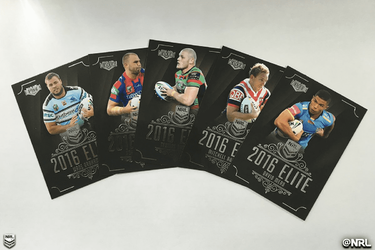
NRL 2016 ESP Elite Official Thread (Checklist Up Pg 36)

I will never understand why you'd put lesser players in the Elite common set.

The only reason I could think of why maybe due to some players don't debut till later in the season or transfer and have no image and this gives collectors an opportunity to get a card of these players
 
As a panthers supporter, I'm hoping that now with Soward leaving as well as seggyaro that there are no cards of them. If so I hope they have enough time to change them for Cleary and Martin
 
As a panthers supporter, I'm hoping that now with Soward leaving as well as seggyaro that there are no cards of them. If so I hope they have enough time to change them for Cleary and Martin

Doubt it, these player lists would have been locked away weeks ago..
 
set 2 became available the other day, as I have pulled out and stopped collecting any further esp cards.
As one gets older and starts to think what is ahead in life and having no chance in hell of having 1 of every card made, it is a no brainer.
If I could get 1 of each I do not think spending upwards of 25k is realistic, considering half of the set would be worth half of what I would pay now in 6 months and would not make any capital gain on it in the next 10 years.
To add a further comment, if any number 36 cards become available, I will still be collecting them.
 
Last edited:
Just noticed that the common and gold special are a 192 card set. This equates to 12 cards per team. Ruby and sapphire are 144 card sets which equates to 9 cards per team.

Wondering what the extra 3 cards per team in the commons and gold special will be.

Any thoughts?

Probably be something similar to Traders with the special Parallel being only 80 cards and regular being 160.
 
upload_2016-7-1_20-33-13.png

This was posted by the official NRL twitter

upload_2016-7-1_20-33-13.png
 
They look great though. Probably a white background would be great for ips, although traders is already like that.
 
I actually think that these designs are very good, except for the background as mentioned before and the fact that '2016 Elite' takes up a third of the card when we already have a logo in the top left telling us who made the cards.
 
I actually think that these designs are very good, except for the background as mentioned before and the fact that '2016 Elite' takes up a third of the card when we already have a logo in the top left telling us who made the cards.
i agree, i would have preferred it if where it says "2016 elite" it instead has the players name, and where it has the players name underneath "2016 elite" it should have the team name instead. plus the fact there aren't team logos on the cards makes me feel as if the cards are missing a little something,but i'm nit-picking at this point. still i think design is very solid
 
Back
Top Bottom