Time to put this commentary to bed....
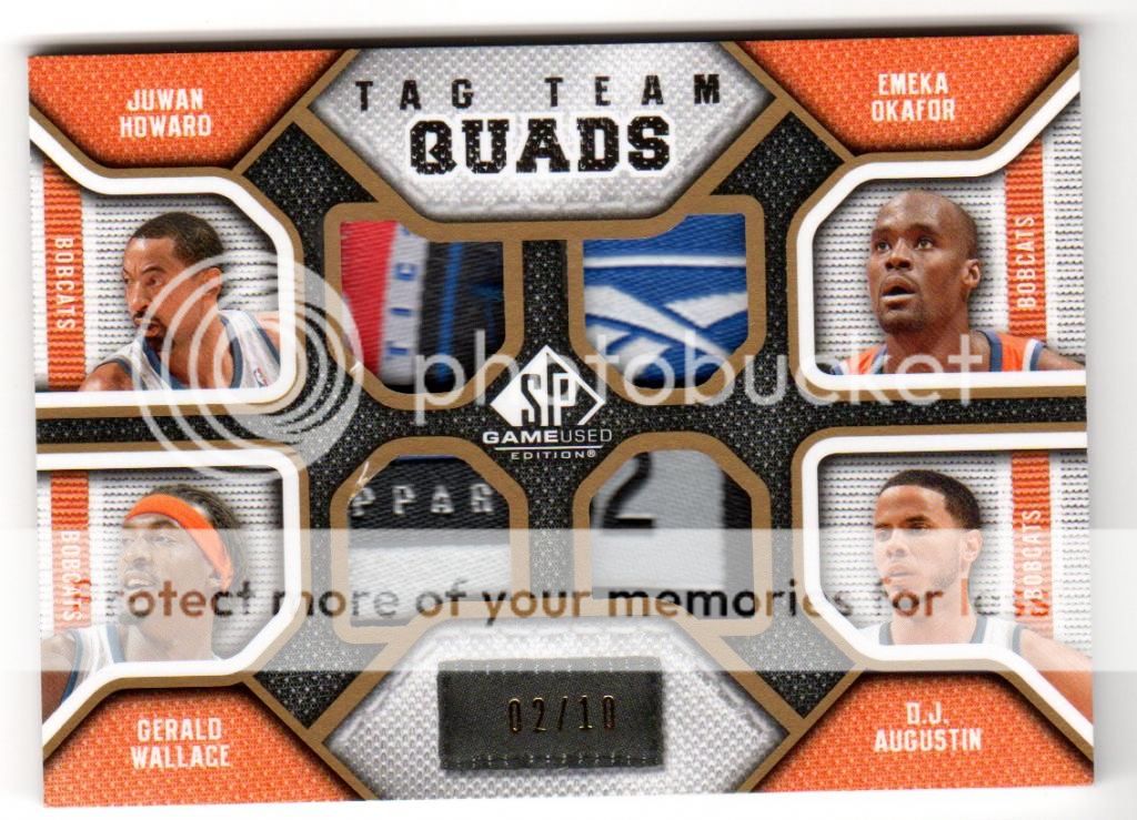
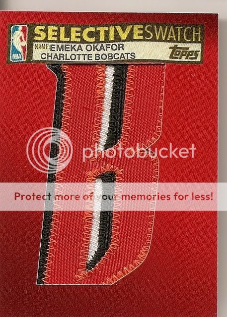
Simonj flops out another couple of big Dirks... The Certified Green /5 is like Sleeping Beauty in that slab, perfect in every way and untarnished by the outside world. Looks pretty and is GEM MINT pure. No dings, no scratches, no whiting - perfect! Somehow the Green Certifieds are always my favourite (not that I've ever owned one) but the design and colour just seems to jump out at you more so than the gold, silver, purple, red, blue, black or whatever other colour Panini wants to throw at you. It's an attention getting, eye catching card. On the downside if you look at it from a non-collector perspective, it's just a green metallic looking card. I'm sure a little kid would see the value in swapping 3 red or blue ones for one green one - that's just good mathematics, right? Even the labelling gives no indication as to it's true worth - the only difference between this and a Gem Mint Certified base card is that the label refers to 'Green' which is well, er stating the obvious. The stamping is on the reverse and there is a 40% chance it's an ebay 1/1 so some possible value add there.... Maybe it's just me but that Certified logo really gets my goat! For a series which prides itself on colour, parallels and making rainbows and black and white logo which resembles a helicopter view of the Starship Enterprise (no, I'm not a trekkie) just seems out of step. If you;re going for colour go all out! And puh-leeez woudl somebody at the Panini photo selection department get a picture of Dirk doing something like his patented one legged fall away jumper instead of shielding the ball. It's just common sense people! Okay, so who can tell me what is better than Exquisite? That's right Extra Exquisite (two E's are always better than one)! Short printed to /10 and with a beautiful on card design this card just flows beautifully and everything fits together nicely. It's subtle and muted colours make for a good contrast with the in your face brash style of Certified. It's the little details which make this card special liekt he symmetrical 3 colour team patches and the embossed logo in the bottom right hand corner which melds seamlessly into the card. That's just great design because the traditional UD silver stamp would have been out of place and if you put the Certified logo there instead, well, you probably would have taken a lot away from the overall impression and impact of the card. What's not to like are the two one colour 'patches' when you pay good money for a quad patch that's what you want to get, and when it's numbered /10 there really can be no excuse for not having four decent quality patches on there. A big on card auto would have fit perfectly in that corner under the pic instead of the extra wording. ..and for crying out loud another pic of Dirk shielding the ball?! WTF?! It's a conspiracy I tell ya! Good contrast but the lack of an auto selection was interesting.
So I think that rounds things off - haven't forgotten anything have I?


 haha
haha


