PC Battle 4 - Round 2 - Group A

Who has the best cards??

  • kiwi_in_melb - Dwight Howard

    Votes: 7 20.0%
  • wjrwebber - Emeka Okafor

    Votes: 6 17.1%
  • Simonj - Dirk Nowitzki

    Votes: 1 2.9%
  • nichj99 - Kenneth Faried

    Votes: 21 60.0%

  • Total voters
    35
  • Poll closed .

drob50

Magic Johnson and David Robinson ON CARD autos
Messages
9,435
Location
Perth, Western Australia
Real Name
Adam
eBay User
None
The competition is getting tighter, the cards are getting crazier! Check out these crazy submissions for round 2 and tell us which 2 should progress to the FINAL!!

Round 2

Group A

@kiwi_in_melb
@wjrwebber
@SimonJ
@nichj99


kiwi_in_melb - Dwight Howard


UD Black Jersey #d
1_zpsxu3smdds.jpg


Exquisite Magic Logo
2_zpsfga7zhyh.jpg


wjrwebber - Emeka Okafor


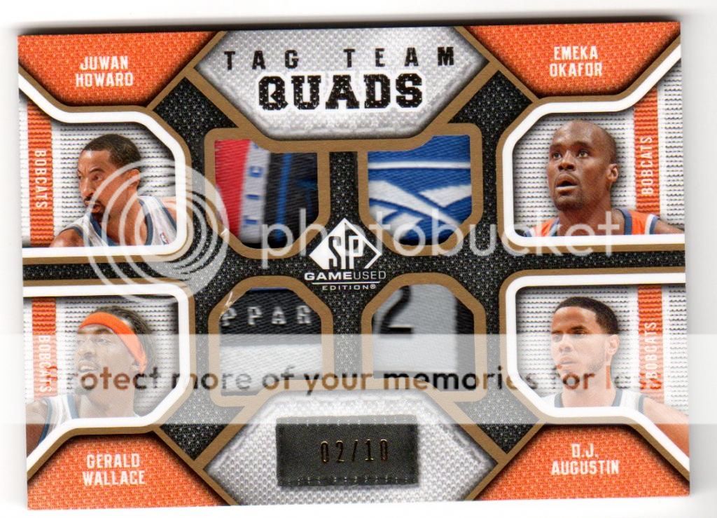
UD SPGU Tag Team Quads /10
img002-2.jpg


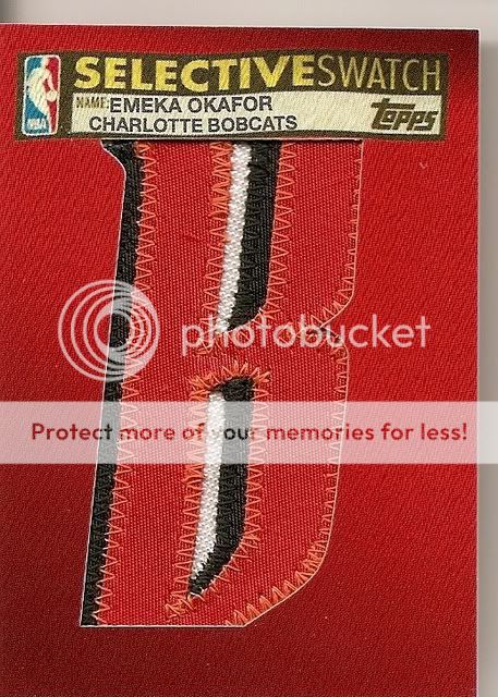
Topps Selective Swatches
scan0027-7.jpg


Simonj - Dirk Nowitzki


10-11 Totally Certified Green /5 Gem Mint
20150709_113816-jpg.134425


Extra Exquisite Quad Patch /10
20150709_113808-jpg.134424


nichj99 - Kenneth Faried


2012-13 Gold Standard Black Gold Threads Prime #/5
11267313_885317794865255_216890397_n-jpg.134769


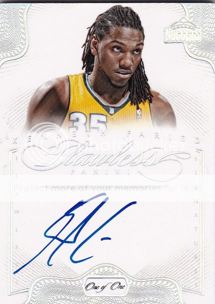
2012-13 Flawless Autographs Platinum 1/1
2012-13FlawlessPlatinumauto1of1KennethFaried_zpsc73b1a81.jpg
 
Following up a logoman with 'lesser' cards makes me feel a bit gypped but they're decent, just wanted to see a big Dirk... Not a fan of cards that don't show the player, but am a fan of Tag Teams... Hot Dwights but those Farieds are yum and get my vote.
 
Here comes another round of commentary gold (even if I do say so myself).....

Kiwi kicks things off with some Kiwi All Black goodness! The gold sharpie means I can't go on about some inane reference to silver ferns but I really do think a silver sharpie on that black and greyish background would have really popped. Although the yellowish glow of the holofoil and gold sharpie does have its own charms. Normally there's enough glare from pics to not really see what the writing is on the card so I was intrigued to see it was the 31 October 2007 season opener against the Bucks and a young Bogut. DH12 grabbed 12 boards, 16 boards and a whopping 7 blocks! Cause to commemorate the occasion with a card! The card design is centred around the showcased auto so you don't really want or need a big action pic to distract you from what is taking centre stage - a big blue and white jersey would do nothing to enhance the aesthetics. I've never really held one of these bad boys in hand so I'm not sure if the auto is on card or on an inserted bit of other cardboard, but either way th effect is nice and I like it. The jersey numbered card /15 is nice touch and is about as rare as you're going to get for a Dwight jersey #d goodness. On a final note the UD Black is renowned for whiting and chipping around the edges and corners,this one looks pretty solid but you can see how the harsh contrast between black surface and white edge isn't a very flattering look. The old school Exquisite patch has the big action pic (Dwight backing down yet another defender with a power dribble) and the die-cut window 'E' adds that extra touch of class you don't get with lower end offerings. The design is a little bit lazy by Exquisite standards with a big white space, but it does accommodate a nasty big on card auto in blue sharpies (albeit a bit streaky) but it matches the Orlando Blue uniform so all is forgiven! The patch is obviously where the money is and if you had to choose any part of the Magic logo you'd have to go for the ball itself, killer stuff, it even has it's own star! However, despite all that awesomeness, stitching and breaks the devil's advocate in me says it's still only two colours. Magical effort to start - one for the Upper Deck fans....

wjrwebber certainly has solid "Oak for" the PC showdown. See what I did there? The Tag Team Quads are from the iconic SPGU series and from memory were a case hit. It's easy to see why collectors loved them so much, low numbered like this beauty /10 and four tags ripped straight from the jersey. A lot depended on the quality of the tags involved and this Bobcats example is the biz! We've got logoman action, reebok emblem, jersey size and wording that reminds us this is indeed genuine apparel. These tags are all well centred and have a good variety of colour which isn't always the case even for rarities such as the Tag Team Quads. The real bonus is that Okafor has the possibly the nicest tag of the lot, it always sucks to get a PC card with a few other blokes on it and you have the worst patch / tag out of the lot! On the downside a couple of the windows are a bit dinged up which is known to happen with deeply set windows and the gold border is not forgiving int at respect. The Bobcats orange was a nice touch to set the card apart from its rivals, for team collectors this would have been one of the best additions they could get, not only for the colour scheme but because ti reminds us of when the Bobcats were starting to assemble a youngish crew to be reckoned with Okafor down low, Crash Wallace and Captain Jack on the wings and a couple of young guards on the rise in DJ and Raymond Felton. What happened?! Still a great piece to remember those Bobcat squads and when Emeka was a double-double machine. Normally I'd take points away for a PC card for featuring others but Okafor was the franchise player for the Bobcats and this represents the pinnacle of his prime years. Topps Selective swatch!!!!!! OMG!OMG! So excited! To the uninitiated this just looks like a poorly cut letterman 'B' with no auto... To the true collectors among us we know it;s more than likely a 1/1 from a game used jersey. That's right, this card literally puts the 'B' in the Bobcats jersey that Emeka actually wore in NBA action! Even without an auto it doesn't get much better than that! Selective swatch ftw! One card which really does get you as close to the action as possible! GEEEE-OHHHHHH, go Bobcats go!

Skip is absolutely zonked for now.....so I'll finish off tomorrow! Plus that way I get to annoy @nichj99 by making him wait another day - lol
 
Time to put this commentary to bed....

Simonj flops out another couple of big Dirks... The Certified Green /5 is like Sleeping Beauty in that slab, perfect in every way and untarnished by the outside world. Looks pretty and is GEM MINT pure. No dings, no scratches, no whiting - perfect! Somehow the Green Certifieds are always my favourite (not that I've ever owned one) but the design and colour just seems to jump out at you more so than the gold, silver, purple, red, blue, black or whatever other colour Panini wants to throw at you. It's an attention getting, eye catching card. On the downside if you look at it from a non-collector perspective, it's just a green metallic looking card. I'm sure a little kid would see the value in swapping 3 red or blue ones for one green one - that's just good mathematics, right? Even the labelling gives no indication as to it's true worth - the only difference between this and a Gem Mint Certified base card is that the label refers to 'Green' which is well, er stating the obvious. The stamping is on the reverse and there is a 40% chance it's an ebay 1/1 so some possible value add there.... Maybe it's just me but that Certified logo really gets my goat! For a series which prides itself on colour, parallels and making rainbows and black and white logo which resembles a helicopter view of the Starship Enterprise (no, I'm not a trekkie) just seems out of step. If you;re going for colour go all out! And puh-leeez woudl somebody at the Panini photo selection department get a picture of Dirk doing something like his patented one legged fall away jumper instead of shielding the ball. It's just common sense people! Okay, so who can tell me what is better than Exquisite? That's right Extra Exquisite (two E's are always better than one)! Short printed to /10 and with a beautiful on card design this card just flows beautifully and everything fits together nicely. It's subtle and muted colours make for a good contrast with the in your face brash style of Certified. It's the little details which make this card special liekt he symmetrical 3 colour team patches and the embossed logo in the bottom right hand corner which melds seamlessly into the card. That's just great design because the traditional UD silver stamp would have been out of place and if you put the Certified logo there instead, well, you probably would have taken a lot away from the overall impression and impact of the card. What's not to like are the two one colour 'patches' when you pay good money for a quad patch that's what you want to get, and when it's numbered /10 there really can be no excuse for not having four decent quality patches on there. A big on card auto would have fit perfectly in that corner under the pic instead of the extra wording. ..and for crying out loud another pic of Dirk shielding the ball?! WTF?! It's a conspiracy I tell ya! Good contrast but the lack of an auto selection was interesting.

So I think that rounds things off - haven't forgotten anything have I?
 
nichj99 is the mainimal in a china shop! In this whole grouping the Black Gold is the only card which features an actual action photo of Faried doing what he is famous for - hauling down rebounds! It sounds so simple but it really does make this card what it is! Bonus points for this particular photo because I'm pretty sure that's the same jersey type the patch was taken from, I don't where exactly but with that much white and straight edge featured I'm guessing it's right off the Nuggets logo which is seriously cool. You can look at the patch and relate it to the action pic straight away. 4 colours, countless breaks and with patches bigger is always better! Something that cool had to be short printed to /5 but did they really have to stamp it THERE?! Whack it on the back of the card because sticking it in the middle of no-man;s land just makes it look like an after-thought (which it probably was?!) In the top loader we can't get a feel for that golden sheen we've come to know and love which has made GS one of the more popular releases. This card got the basics right and the result is a serious bit of eye candy. Ebay 1/1 too - bonus! The first thing you notice about the Flawless is that calssy 'One of One' wording which takes pride of place front and centre! Note the difference to how the 1/5 stamp was treated on the GS, little things can and do make a big difference! The big on card autos are always a winner, this one is slightly skewed left but that doesn't ruin the party at all! Teh one thing about such a big designated signing space is that it limits the ability to have a big action pic or slice of memorabilia. With a half pic you're more or less forced to go with a portrait shot - perhaps they could have got one of him smiling?! When I look at that pic it looks like the ref just called him for a questionable foul.... The contrast of the coloured pic on the white background is a nice effect but as other members have noted at OZCT Panini seems to have gone overboard with their 'white cards'. They do look classy but at some point they all begin to look a bit alike... I'm still trying to figure out if I like that white on white Nuggets logo in the top right hand corner. It blends into the card well and a full blooded colour shot wouldn't be a good look but I'm not sure what it adds by being there in the first place... In any case at this stage of proceedings the manimal has got loose and is running rampant! Try to stop it if you can!
 
Back
Top Bottom