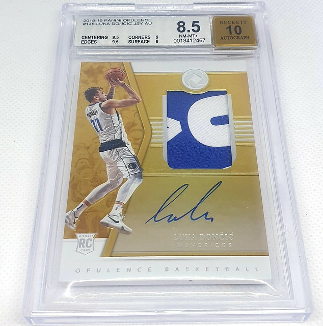
Show something off

Forgot about this thread!

Picked this up last week - only one each as a PSA 8, 9 and 10 for now but this is a cool looking card, as is the whole Mystique set

7BF74E82-26FA-4AA6-8DF4-3E055375F630.jpeg
 
Forgot about this thread!

Picked this up last week - only one each as a PSA 8, 9 and 10 for now but this is a cool looking card, as is the whole Mystique set
Fleer/Skybox stuff from 1995-96 to about 1999-00 were awesome. Even the Topps stuff weren't bad. Some classic creative designs with a lot of their cards. You'd think with technology, etc, that things would've still been great but for the most part from 2000-01 most sets have been crap, just a lazy swatch or auto here and there.
 
Pre x-mas bump.
Latest project ive been working on the past couple months. Guess which 1 card I am missing. Will take me a while to find so posting this pic as I shelve this project until the final card pops up.
20211223_144419.jpg
Are you missing Prizm 2012?
 
Yep, that's the one. The OG prizm. Its great to see all the prizms from across the years next to each other and to compare their designs. 2012 and 2013 to me are the nicest. Ugliest would be 2014 followed by 2017. And, yes it is a tribute to kobe, but Lebron is just way to small in the 2020 pic.
 
Last edited:
Yep, that's the one. The OG prizm. Its great to see all the prizms from across the years next to each other and to compare their designs. 2012 and 2013 to me are the nicest. Ugliest would be 2014 followed by 2017. And, yes it is a tribute to kobe, but Lebron is just way to small in the 2020 pic.

totally agree on that tribute dunk sizing y
 
Yep, that's the one. The OG prizm. Its great to see all the prizms from across the years next to each other and to compare their designs. 2012 and 2013 to me are the nicest. Ugliest would be 2014 followed by 2017. And, yes it is a tribute to kobe, but Lebron is just way to small in the 2020 pic.

See, they all look pretty much the same to me! About the only major difference I see is one is horizontal.

That is my big problem with Panini, they make some nice cards but they tend to have zero imagination — once they get to something people like they just keep repeating it.

Compare Prizm to something like Finest and look at how much Finest changed over a decade and how little Prizm has.

I think it is a very smart move from a business and collector perspective. Prizm was a big hit. Collectors loved it and it became Panini's flagship product. They found a formula that resonated with collectors and they stuck with it. Keep giving those original collectors what they want by creating a design that reflects the prizm formula - chrome stock of an action shot with background imagery and framed in a retro, sharp, angled border. You don't change a winning product, you tweak it. And to cater for new customer's and different tastes you release other chrome products with different designs - Optic, Contenders, Select, etc.
This is nothing new and is exactly what Topps did as well. Topps Chrome have a very similar feel over the years 2003-2009. They also released different refractor stock designs to cater for different tastes like Finest, Bowman, Pristine, etc.

I completely agree that it has worked well for Panini — but to me they are just a bit boring. You can 90% tell what Prizm will look like before it comes out, which many people love, but just doesn't get me excited.

Also, agree that Topps Chrome got pretty mundane over the years. Hence, why I have preferred Finest and as you mention Bowman's Best which did have more variety.
 
Back
Top Bottom